How does Palaces new kit fare after repeat viewing?
September 25 2020
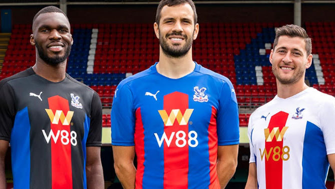
CPFC kits for 2020/21
Of all of the clubs in the Premier League, when it comes to kits, Crystal Palace's rarely fail to impress.
With a new season comes a new wave of kits, with Palace rolling out a blue and red home kit, a white away kit featuring a red and blue stripe, and a black third kit also featuring the red and blue stripe. All three strips are of the same format, offering fans the chance to pick whichever background colour they prefer.
Now, several games into the 2020/21 campaign, weve seen the new kits in action enough to judge them properly. So, how do the new Eagles shirts rank across the board?
Few can contend with the colours of Crystal Palace
There are many 2020/21 Premier League shirt rankings on the internet. Some like the basic red with white-and-teal collars and cuffs of Liverpool, others like the nostalgia of Newcastles classic black-and-white stripes that rarely change.
Southampton are also quite highly praised for their kit, having walked onto the pitch in a trendy sash design, straying from the stripes to a style that has worked very well for Palace alternate kits in the past.
However, Crystal Palaces understated and classy kit is the one that ranks above all others this season. Particularly with the home kit, the design is superbly simple yet bold, with the blue shoulders blending into the stripes and the red stripe blocks adding some shape.
The templates effectiveness when it comes to the away and third kit using three colours instead of two is lessened, somewhat, but the more frequently-used home kit is a thing of beauty.
Nowadays, a sponsor can ruin a nice kit
Often put up there with the nicer kits, Wolverhampton Wanderers have the same sponsor as the Eagles had last season, and it has sunk their aesthetics a fair bit. As was the case for Palaces shirts last year, theres just too much going on with a logo, Chinese text, and then brand print as well. In fairness, a gambling sponsors design rarely compliments a football shirt, with there being perhaps one shining example in the past.
As much as they are London rivals, albeit, from the north side, Tottenham Hotspurs pure white and baby blue shirts of 2006/07 showed precisely how a gambling sponsor could work on a Premier League shirt.
At the time, Mansion wasnt the most prominent brand, whereas nowadays they are rated as the best casino with a signup bonus, but their clean-cut, and somewhat classy, logo with Mansion beneath made for a good-looking sponsor for the equally clean-cut Spurs shirts.
Pascal Chimbonda and Mido joins Spurs in August 2006 #COYS pic.twitter.com/PiFhwBXj2b
— Spurs Nostalgia (@thfcnostalgia) August 19, 2015
This year, the number of gambling sponsors in the top flight has fallen from ten in 20 to eight. Burnley, Fulham, Leeds United, Newcastle, Southampton, West Ham United, and Wolves join Palace in this regard.
Out of them all, though, the Eagles certainly wear it best. The minimal text with the slick gold logo makes for a pleasant accent to the superb kit design, which is one of the reasons why Palaces home shirt is the best in the league this season.
Eagles fans are regularly blessed with a slick kit design, and this year isnt any different.
Latest Headlines
-

Palace swoop for Spain defender
Jul 9 2026 -
Can Palace Build On Last Seasons Success?
Jul 9 2026 -

What Pierre Sage could bring to Selhurst Park
Jul 1 2026
Palace Talk Forum Latest
Lacroix
at 12.53am by McAhuna
Team vs Bromley
at 11.56pm by pssguy
Main Stand redevelopment thread
at 10.26pm by aashman12
Loaned-Out Players
at 8.26pm by Team of the (20)80s
Walter Benitez
at 8.07pm by RubinsCube
How about a Match-day presentation or other accolades for Eagles back from the World Cup
at 6.12pm by Linford
Next season's kit
at 6.05pm by Linford
Eagle Football Group / Textor in Administration
at 6.01pm by Linford
Team v Swindon
at 12.04pm by Linford
welcome to Brennan Johnson
at 9.22am by TheBigToePunt
All images and text on this site are copyright © 1999-2025 The Holmesdale Online, unless otherwise stated.
Web Design by Guntrisoft Ltd.